When Science Needs Visuals—But the Scientist Isn’t an Artist
On the difference between illustrating reality and evoking ideas
My initial reaction upon reading Why Science Communication Needs Visuals was straightforward: “Yes—but what if the scientist is not an artist?”
The reasons given by the Association of Science Communicators article for incorporating art are clear enough:
Capture attention in an information-saturated world
Explain complex phenomena
Take advantage of the transformative power of conceptual metaphors
The first two are familiar. “Capture attention” is a practical necessity when addressing a general audience, and “a picture is worth a thousand words” has long served as shorthand for the explanatory power of images.
The third point—using conceptual metaphors—is where things become more complicated.
To begin, an author must decide which idea is actually worth communicating. In any piece containing multiple ideas, that can be difficult.
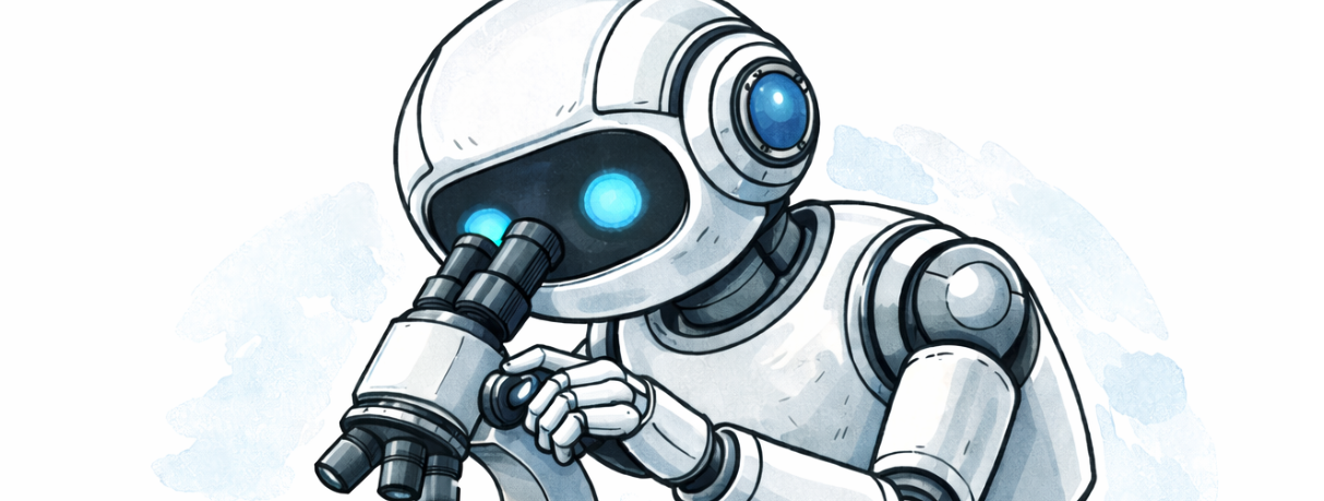
Once that choice is made, the next challenge is finding a visual metaphor that helps convey the idea clearly. This is possible, but not always easy—especially when the metaphors that first come to mind are predictable or overused. (Robots representing AI is a device I have used myself. I apologize!)
At this point, it is worth making a distinction that the article tends to blur. An artist can certainly help make a complex event, action, or idea understandable. That is one kind of contribution—grounded in clarifying or representing physical reality, even when the underlying phenomena are not directly observable. But that is quite different from representing a concept metaphorically or symbolically. These are two distinct kinds of artistic applications, and they serve different purposes.
A scientist reporting a research finding would, I suspect, generally prefer the former: a visual representation that reflects physical reality as faithfully as possible. That kind of illustration supports understanding of what actually occurs. A metaphorical or symbolic image, by contrast, does something else—it frames how we think about the idea rather than showing what it is.
The authors of Why Science Communication Needs Visuals acknowledge the difficulty faced by non-artists and caution against overreliance on AI-generated imagery:
“AI tools can be incredibly useful to artists (I admit to using them myself), but the tool cannot replace the artisan. Because science communication needs more than just visuals—it needs the human creativity, understanding, and skills that only trained illustrators can provide.”
I’m sympathetic to that view. I’m not an artist, but I regularly need images to accompany the articles I publish in the Managing Technology section of my website. When I cannot use my own photographs or readily available sources, I turn to tools like ChatGPT to generate images.
What I am usually looking for is not an illustration of a specific event—say, what happens when two molecules interact—but rather a representation of a key idea. The images I use are often metaphorical rather than descriptive.
Producing those images is rarely straightforward. It typically involves a back-and-forth process in which successive versions are refined through prompt adjustments. Over time, I have learned how to guide that process more effectively, though it remains something of an iterative negotiation between intention and outcome.
Does this place me in the camp of those who see AI tools as replacements for human artists?
Not really. I have hired artists in the past for professional or commercial work, and I would do so again where the stakes justify it. But for the short, exploratory pieces I publish on my personal website, that has never been a practical option. In that context, AI-generated images are sufficient.
But I would still prefer to work with a professional artist whenever fidelity to physical reality matters. I am not trying to document phenomena so much as to suggest ways of thinking about them.
That distinction matters. There is a meaningful difference between illustrating a phenomenon and evoking a concept. The former aims at accuracy; the latter at interpretation. Both have value.
For now, I continue to experiment with tools that allow me to represent ideas more economically, if not more precisely. What I am learning is that conceptual images—while imperfect—can still be useful.
Copyright © 2026 by Dennis D. McDonald
Addendum 1: Examples illustrating the distinction discussed above:
Conceptual illustration that works: https://www.ddmcd.com/managing-technology/impacts
Conceptual illustration that falls short: https://www.ddmcd.com/managing-technology/mynews4
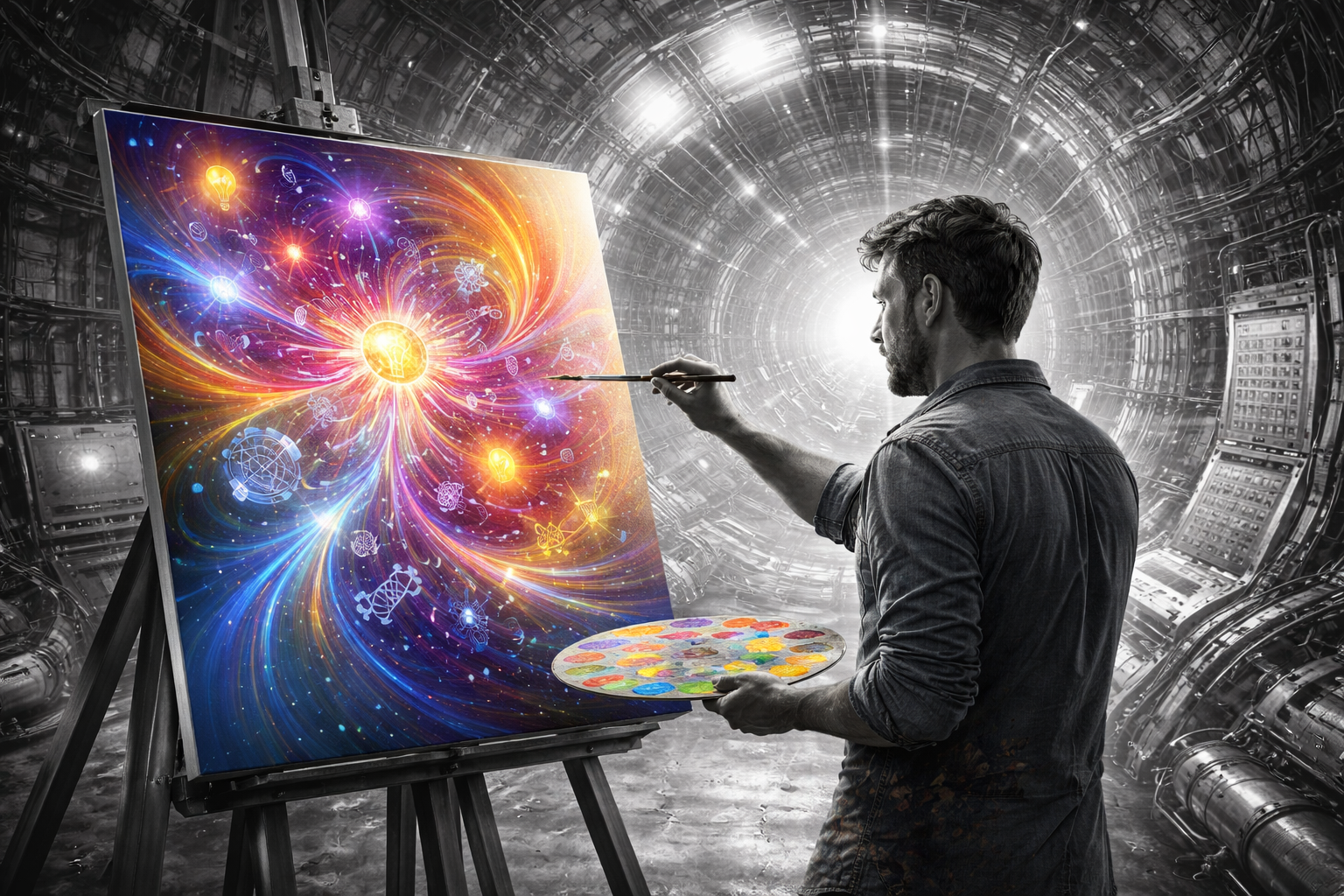
Addendum 2: ChatGPT’s own reverse engineered prompt describing generation of the artist-at-his-easel image at the head of this article:
A thoughtful, realistic scene of an artist standing at an easel inside a large, complex scientific environment, such as a particle accelerator or advanced laboratory. The surrounding machinery—pipes, cables, control panels, and structural elements—is rendered in monochrome (black, white, and shades of gray), highly detailed and precise, emphasizing physical reality and technical complexity.
The artist is actively painting on a canvas. In contrast to the monochrome environment, the painting is vivid, colorful, and expressive—an abstract, symbolic interpretation of what the artist sees. The canvas contains flowing shapes, light, and conceptual imagery (such as energy patterns, connections, or abstract forms), not a literal depiction of the machinery.
The composition should emphasize the contrast between the grayscale “real world” and the colorful “interpreted world” on the canvas. Lighting and composition should draw the viewer’s eye to the painting while still showing the scale and complexity of the machinery behind the artist. The overall tone should be thoughtful, reflective, and slightly cinematic, suitable for an essay about science, art, and interpretation.